When a user encounters an unexpected problem on a website or struggles to achieve a goal in an application, they become frustrated. There are many possible causes of user frustration. However, in most cases, users will abandon the website, look for an alternative, and ultimately lose business.
This article will explore the top reasons why users are frustrated and offer potential solutions for increasing customer satisfaction and conversion rates.
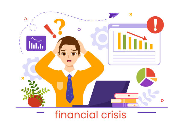
The most common signs of user frustration
When expectations don’t match reality, it is the most common cause of user frustration. A user expects a certain action to affect the website or application, but it doesn’t.
Here are some of the most common signs that users are frustrated.
Rage Clicks
When a user clicks on a button or an area of a web page multiple times, this is an indication that the user is frustrated. In most cases, the user expects something to happen, but in reality, they don’t get what they expect.
The rage clicks are usually correlated with slow page loading and bugs. This is when the page button doesn’t do what the user expects or does it much slower than expected. Tracking rage clicks can help you detect bugs and fix them as quickly as possible.
Clicking on the error button
Unexpected errors that result from clicking can frustrate users. The application can handle the error and show it in a popup. Or, the error can be unforeseen and detected by developers.
Tracking errors at scale helps detect bugs before users abandon a website.
Dead Clicks
Dead clicks have the same nature as rage clicks but do not require more than one click. A quiet click can occur with just one click. It can result in no changes to the page and no navigation. The user clicked the button expecting an action, but nothing happened.
Dead clicks are a great way to identify problems and areas that need improvement.
Slow Page Load
The user experience can be improved by detecting slow pages and dynamic areas (loaded using dynamic Ajax).
Users expect websites and pages to load quickly and navigate easily. If they can’t do that, they will look elsewhere. A one-second delay in the page loading can lead to a 7% decrease in conversion.
Many free tools are available to improve page speed. Examples include Google PagesSpeed and GTmetrix. They can be used to scan your website periodically for speed improvements while you are developing it.
Random scrolling
If a user scrolls randomly up and down a page, it may be a sign of confusion or frustration. The user might be looking for something but can’t find it. By identifying such behaviors, you can identify areas of the product where improvements can be made to improve user experience.
Users often use random scrolling to find a particular part of a long post or website page. This is especially useful when they are trying to find elusive content. Add a table-of-contents section to the top of the long page to make navigation easier.
Page U-turn
A U-turn can occur when a user quickly navigates to another page and then returns to the first page (within seconds). A U-turn can be a sign of frustration for the user, who was looking for content and clicked on a link to get there, only to find himself in a completely different location.
Optimizing U-turn scenarios can improve the user experience and help them go through the journey that you imagined for the onboarding of the product or other trips within the website.
Circling mouse movement
Many users will instinctively move their mouse in circles when they are waiting for something to happen. This can be a sign that the user has been waiting much longer than expected and wants to see results sooner.
The detection of circular mouse movements can be used to locate slow areas on your website and reduce frustration.
Forms that have been abandoned
Form-filling processes that are abandoned after at the very least one field has been filled out in the form are called abandoned forms. The user is usually frustrated by the size, number, or nature of the content of the form.
By detecting abandoned forms and observing the user experience, you can identify areas that need improvement. For example, by reducing the number of fields, dividing it into multiple parts lo, lowering the barriers to entry (asking for less sensitive or private data), or reducing the amount of information required to complete the form.
Buttons disabled
Users may not know what to do to enable a disabled feature. Hovering over disabled buttons can be a sign of frustration and may help identify users who are unsure how to proceed to the next stage in their journey.
Extensive zoom
It is a good indication that your font size may not be optimal for the majority of users if they are frequently zooming in and out on your website. It can be not easy to choose the font size for content and blog websites. This is because fonts should work well on different devices.
By grouping users based on device type and resolution and by watching the session recordings of each group, you can identify and fix these issues. This will help to increase customer satisfaction and retain more customers.